King Library Booking Portal
I redesigned the San Jose State University & King Library's frustrating study room booking portal focusing on usability and using user research.
Context
Solo Student Project
Timeline
May - June 2025 (6 weeks)
Highlights
A Simple Task Done Right
For an average student, booking a study room should be a simple task. But the original portal was overcomplicated, messy, and confusing. Using user research methodologies and design principles, I improved the usability and visual quality of the portal.
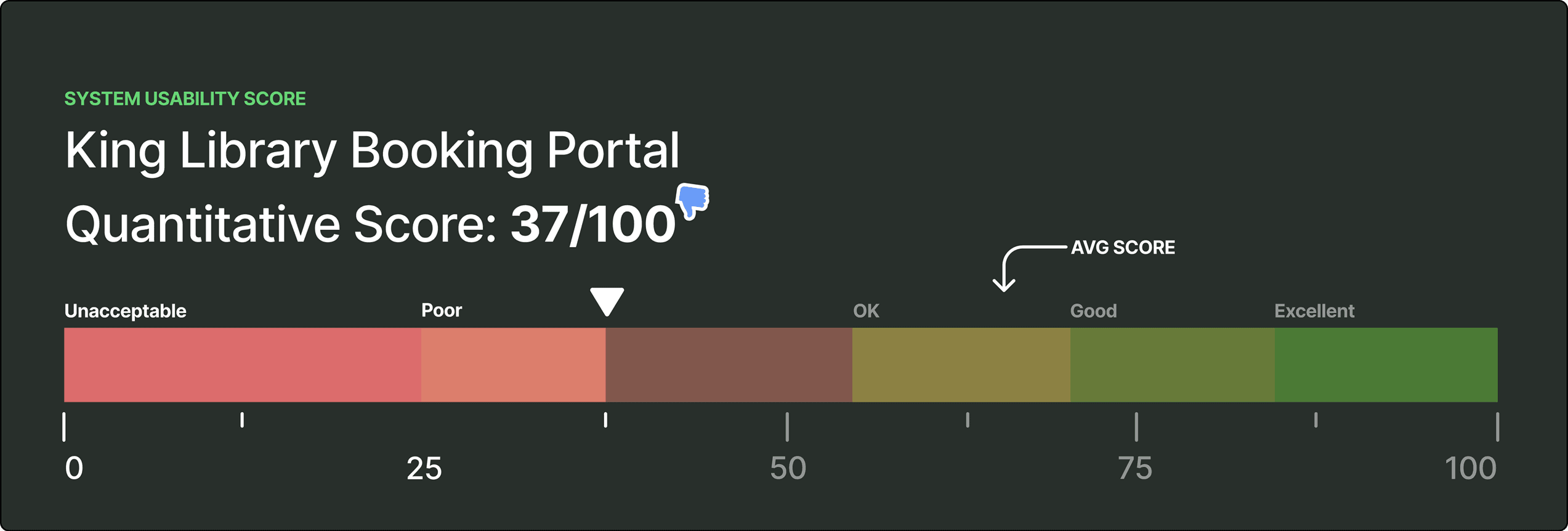
+50.5 points in usability score
Using a System Usability Scale survey on users, the redesign launched the portal from 37/100 to a 87.5/100.

+183% in perceived visual quality
On a simple 5-point Likert question, users on average ranked the old design at 1.5/5 versus the new design at 4.25/5.
Context
Public sector portals are perceived as archaic and overcomplicated, but I'm a firm believer that they don't have to be. With this project, I wanted to challenge bias and show that accessible design can still be modern and user-friendly.
Background
The portal is primarily used by SJSU students.
Used to books private rooms for calls, studying, or resting.
Jointly ran by SJSU and San Jose Public Library.
Design Audit

The Original Design
I began by understanding the overall flow and structure of the the original design by combing through the portal. I then mapped potential issues against NN/g's 10 Usability Heuristics, the most critical follow.
Uncovered Critical Issues

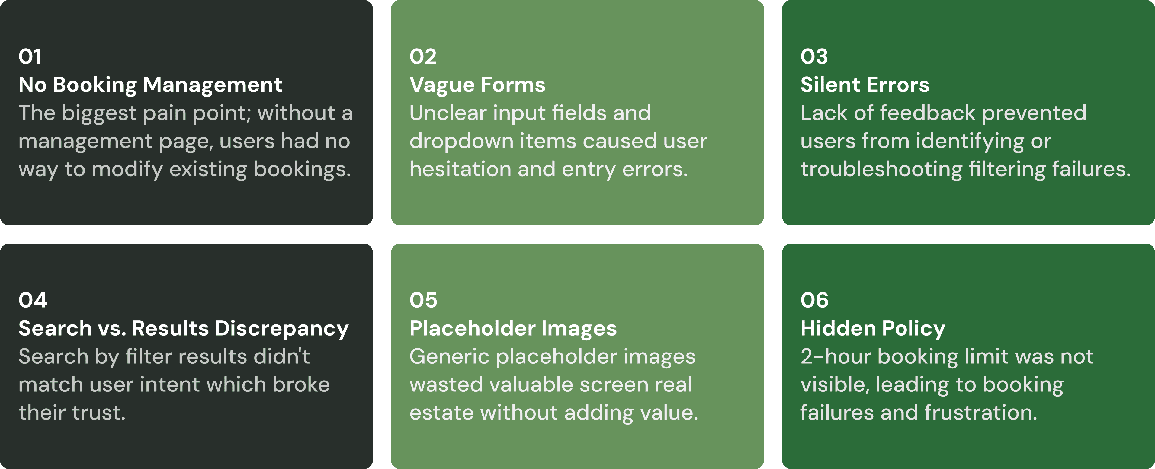
Inability to Manage Bookings
Users must dig through emails to cancel. With no onsite option and a 2-hour limit, managing bookings is impossible.
Overwhelmed by Options
The ability to book by time, space, and calendar view is unnecessary and overwhelming for a task this simple.
Messy Wall of Text
On landing, users are hit with a wall of text and important info is buried under a lack of visual hierarchy and styling.

Inconsistency in Terms
The form dropdowns for “Category” and “Zone” contain the same items, what's the difference?
Usability Testing & Synthesis
I conducted usability tests with 5 users using an end-to-end booking flow and a two part prompt.
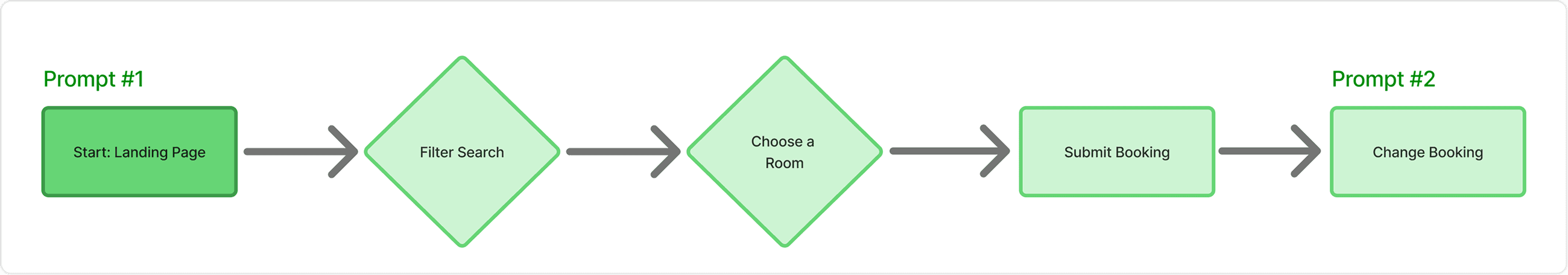
I designed a realistic scenario where participants (SJSU students ages 19-21) were tasked with booking a room for a group project, then asked to pivot and reschedule. I used the fly on the wall and think-aloud protocol to hear their thoughts.
The most critical failure was in the second prompt. When a groupmate's schedule changed, every single participant failed to reschedule without external help! But even more pain points were uncovered, expanded upon below.
Uncovered Pain Points
Quantitative Data
Along with the usability test, I also gave participants a post-task questionnaire and ranked their experience with the system against the System Usability Scale (SUS).
And, at the end, users were given two simple 5 point Likert Scale questions to summarize their overall experience with the portal's usability and aesthetics.

Users Were Neutral on Usability
When asked "overall, I found the booking portal easy to use and not confusing," the average ranking was at 2.75/5

Users Were Negative on Aesthetics
When asked, "overall, I found the booking portal aesthetically pleasing and well-organized," the average ranking was at 1.5/5
I was then able to take my research findings and turn them into an improved design which aimed to increase qualitative experiences and the usability and aesthetic metrics.
Final Design
Improved Landing Page
I replaced the visually busy banner and removed the wall of text, opting to integrate info only when needed. The search and calendar views are now shown side by side, supported by a clearer text hierarchy for improved scannability.

Improved Filter Search
There is now one cohesive room search (rather than time vs. space) with a more intuitive space-first flow. I improved 2-hour limit salience, and cut fluff to make the form more streamlined.

Added Ability to Manage Bookings
The new design gives users the ability to manage bookings, an essential function that wasn't present in the original design. I also designed the page to be able to scale to multiple bookings.
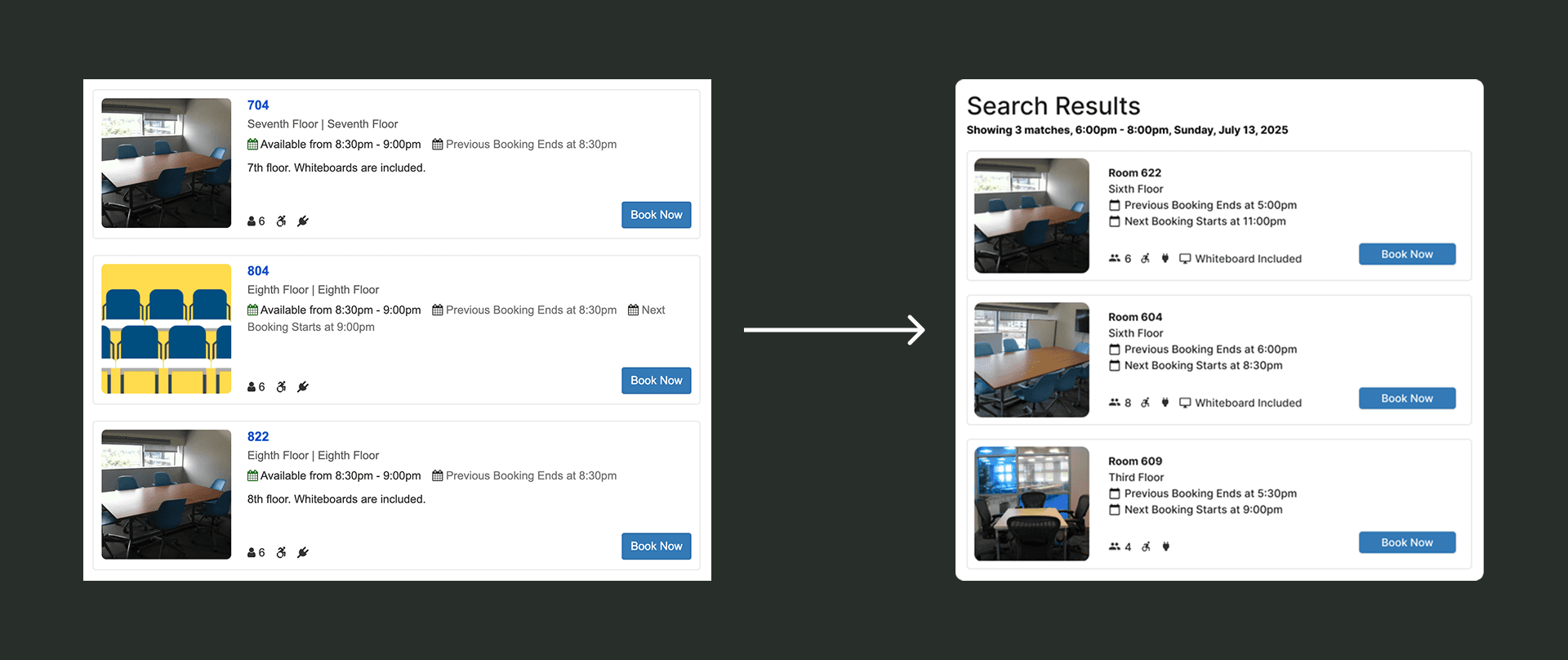
Improved Search Results
Room results no longer held placeholders, instead utilizing the users' attention to show representative room pictures. I also improved the information architecture of the room cards to improve clarity and scannability.
Full Prototype Flow
In the end, an interactive prototype was produced with a second round of validation usability testing in mind. Above is the full flow, feel free to check out the prototype for yourself here!
Validation
Using the prototype, I ran five more usability tests in the same format to measure improvement and impact, and the results indicate a major success!

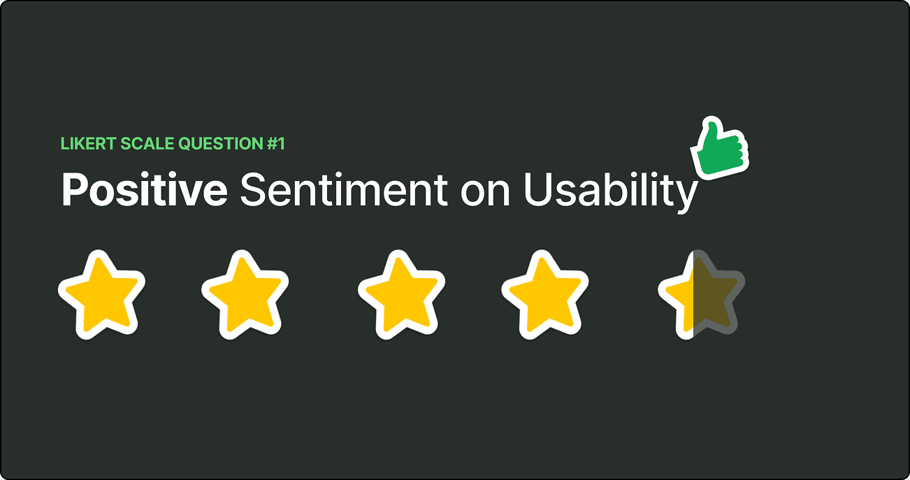
+55% in Perceived Usability
Average ranking for users in usability is 4.25/5 for the new design, a 55% improvement.
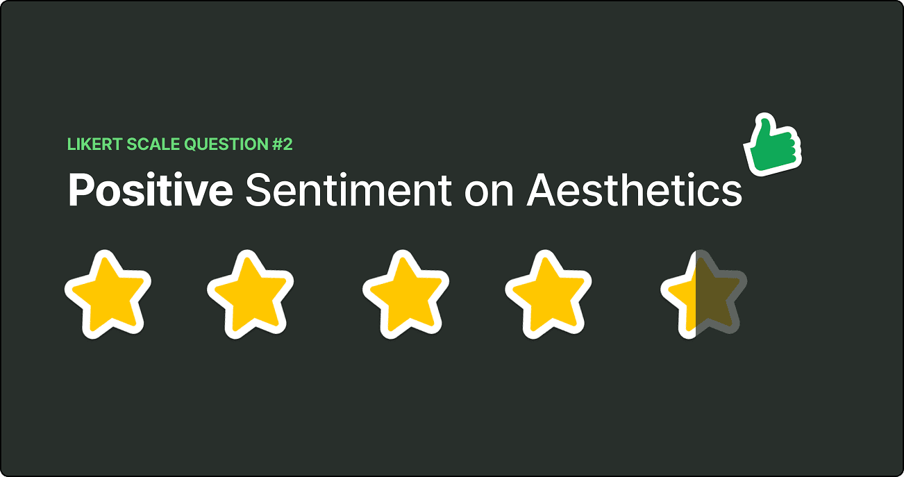
+183% in Perceived Aesthetics
Average ranking for users in aesthetics is 4.25/5 for the new design, a staggering 183% improvement.
The new design was not only a qualitative success, but a quantitative success. It increased usability, improved aesthetics, and reduced user frustration, turning a frustrating task into a simple one.
Reflection
Evidence Beats Assumptions
Through the user research process, I was able to see just how important evidence like user behavior and usability metrics are for design compared to just intuition and feeling.
User Empathy
Interacting with participants and allowing myself to be surprised really pushed my design much further than it would've otherwise gone.

