King Library Booking
A redesign of San Jose State University & King Library's frustrating study room booking portal
Role
UX Designer
Date
Apr - July 2025
Scope
User Research, Usability Testing, Prototyping
Tools
Figma, Google Forms
⭐️ Highlights
01 The Problem
SJSU students often find the King Library Booking Portal difficult to use. Like many government websites, it feels outdated and frustrating.
Challenging Bias
But it doesn't have to be confusing. Government portals like BenefitsCal prove that accessible design can still be modern and user-friendly.
Context
The portal is primarily used by SJSU students.
Books semi-private rooms for calls, studying, or resting
Jointly ran by SJSU and SJPL (San Jose Public Library)
02 Discovery — Heuristic Evaluation
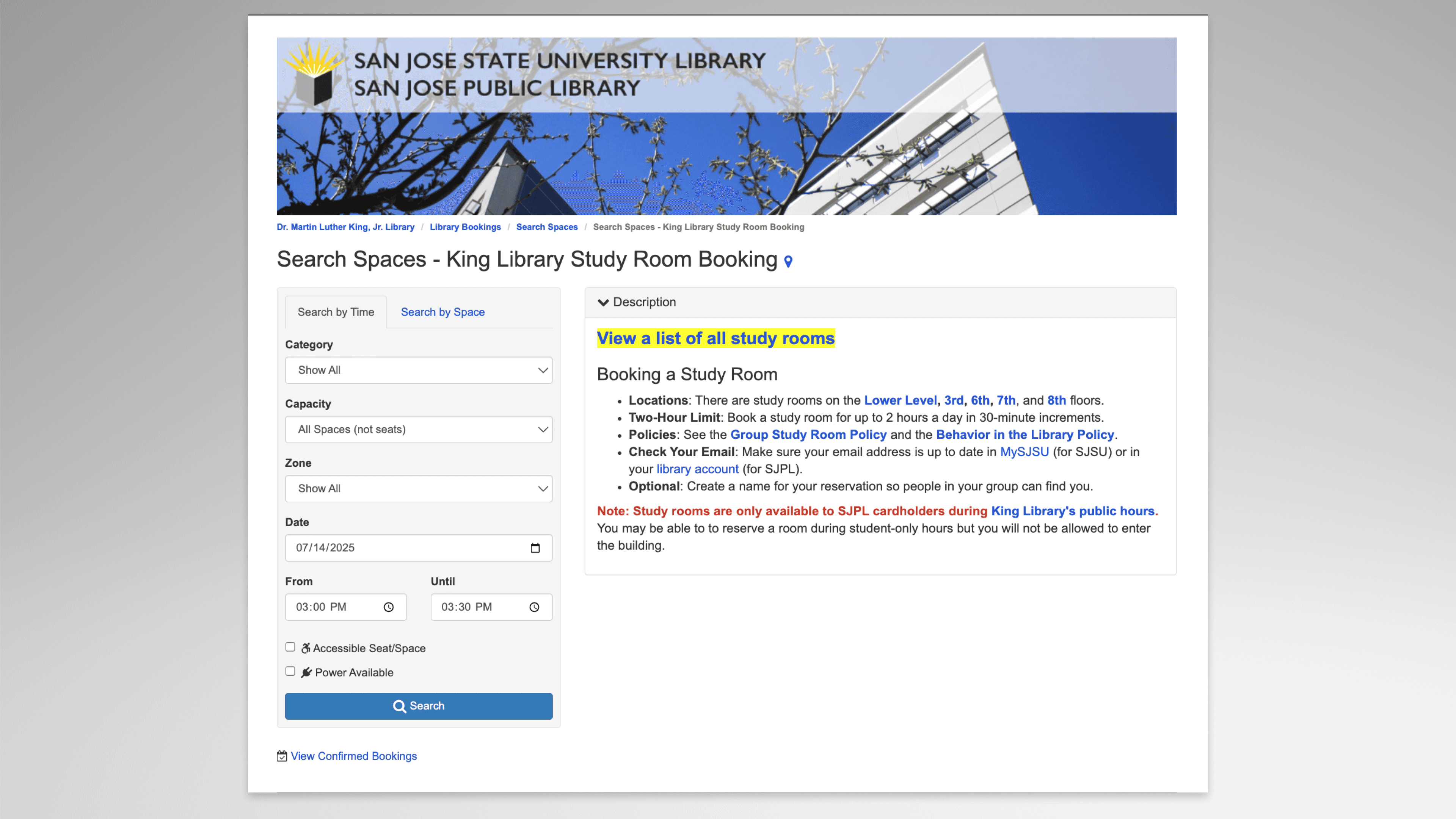
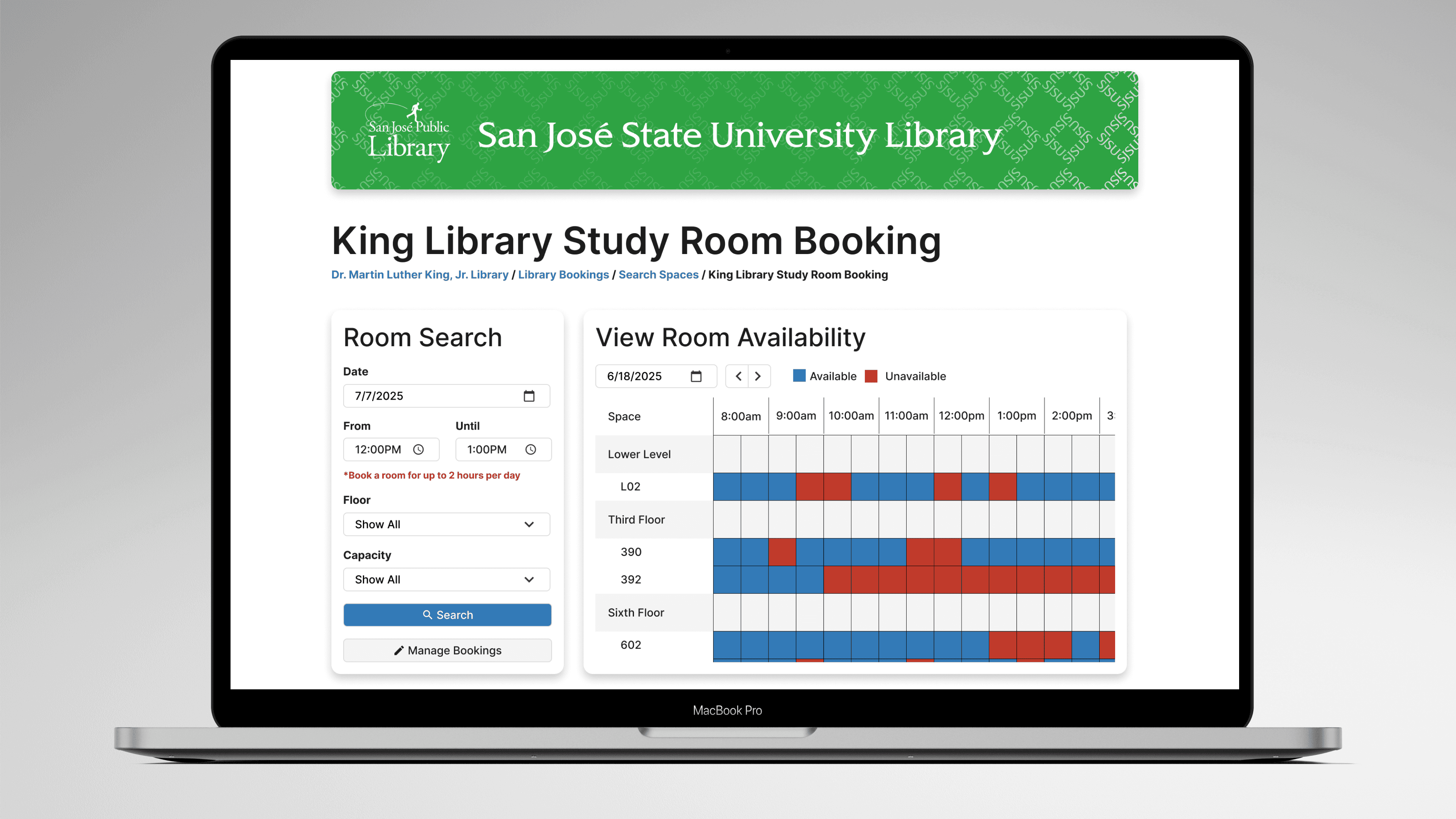
Original landing page
Design Audit
I began by seeking to understand the overall flow and structure of the process by combing through the portal’s pages and interactions. I mapped potential issues against NN/g's 10 Usability Heuristics, the most critical are as follows.
Inability to Manage Bookings
Users must dig through email to cancel. With no in-app option and a 2-hour limit, managing bookings is frustrating.
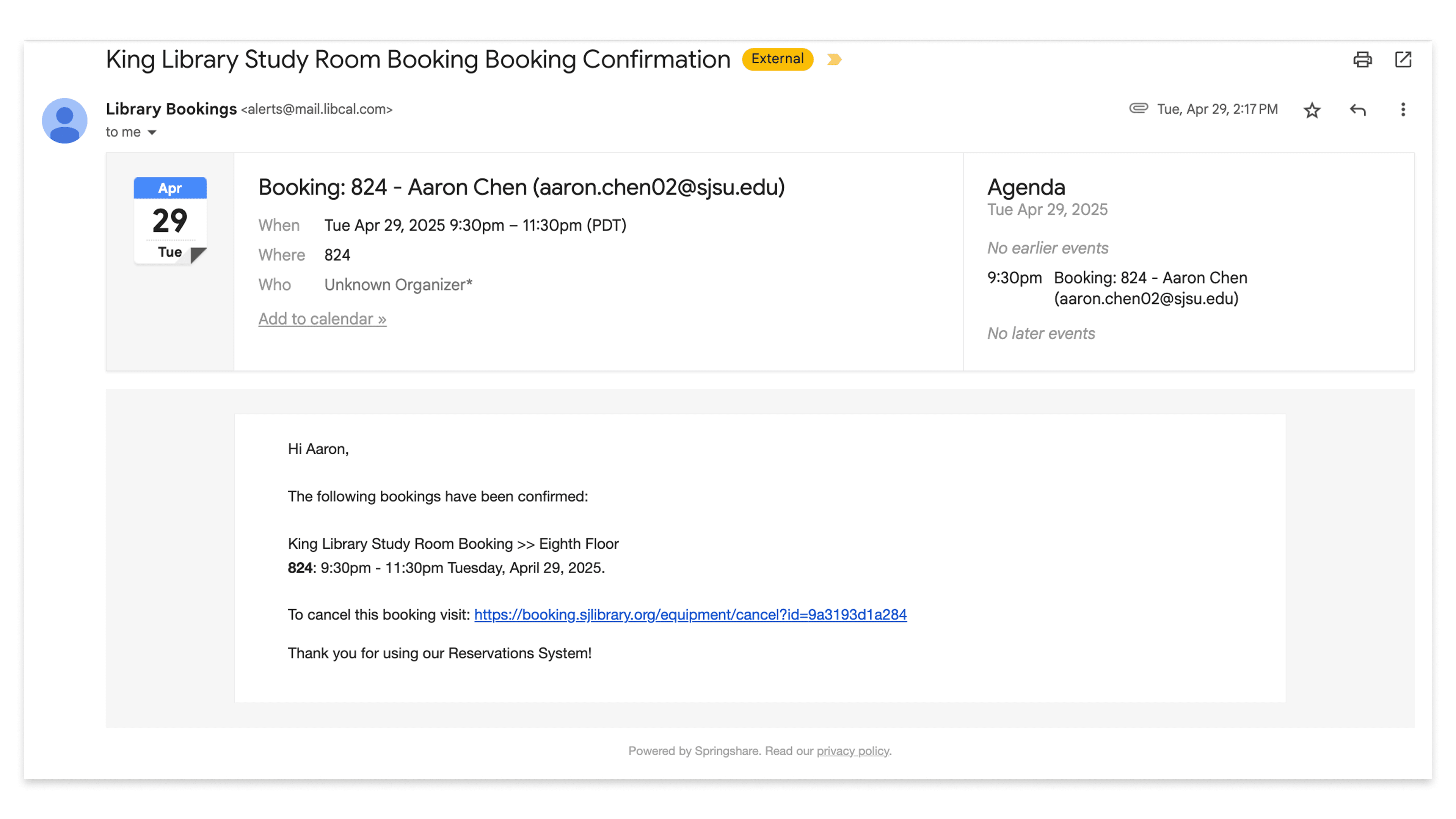
Confirmation email
Overwhelmed by Options
Three booking types shown at once confuse users. They’re forced to decide before they understand the options.

Time, Space, and Calendar Searches
Messy Wall of Text
On landing, user is hit with a wall of text. Important info is buried under a lack of visual hierarchy and inconsistent styling.

Wall of text!
Inconsistency in Terms
The form dropdown for “Category” and “Zone” contain the same items which can confuse the user, what's the difference?
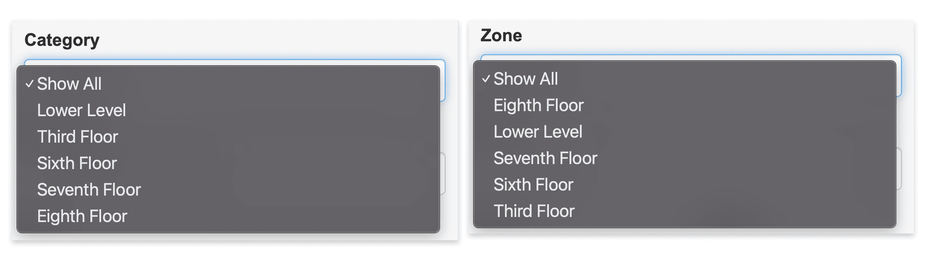
Category and Zone"form dropdowns pictured above
03 Discovery — Usability Testing
A heuristic evaluation is just the first step. Validating these issues through usability testing with users was necessary to see the real pain points.
Who We Tested
Five SJSU students (ages 19–21) with varying familiarity with the booking portal. This reflects the portal’s core user group.
What We Asked Them To Do
Students were asked to book a group study room for 5 people at 6:00 PM, three days out. The scenario was realistic and covered the full booking flow.
They were guided using the Think-Aloud Protocol. Then came a twist: one group member was now only free after 7:00 PM. Could they reschedule?
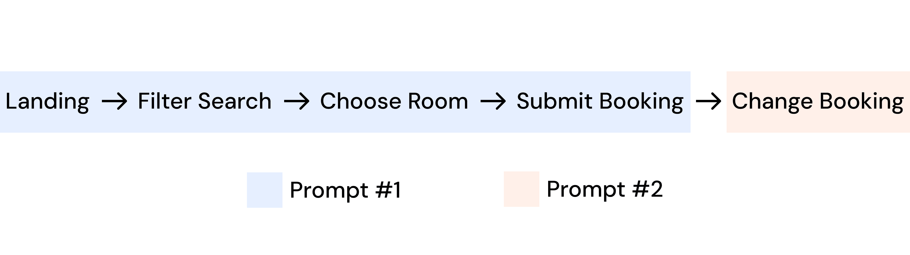
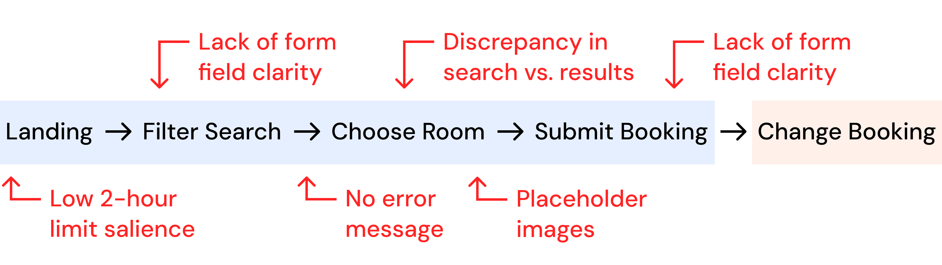
Common Pain Points
In phase #1, participants ran into major roadblocks with common pain points along the flow pictured below.
What Happened
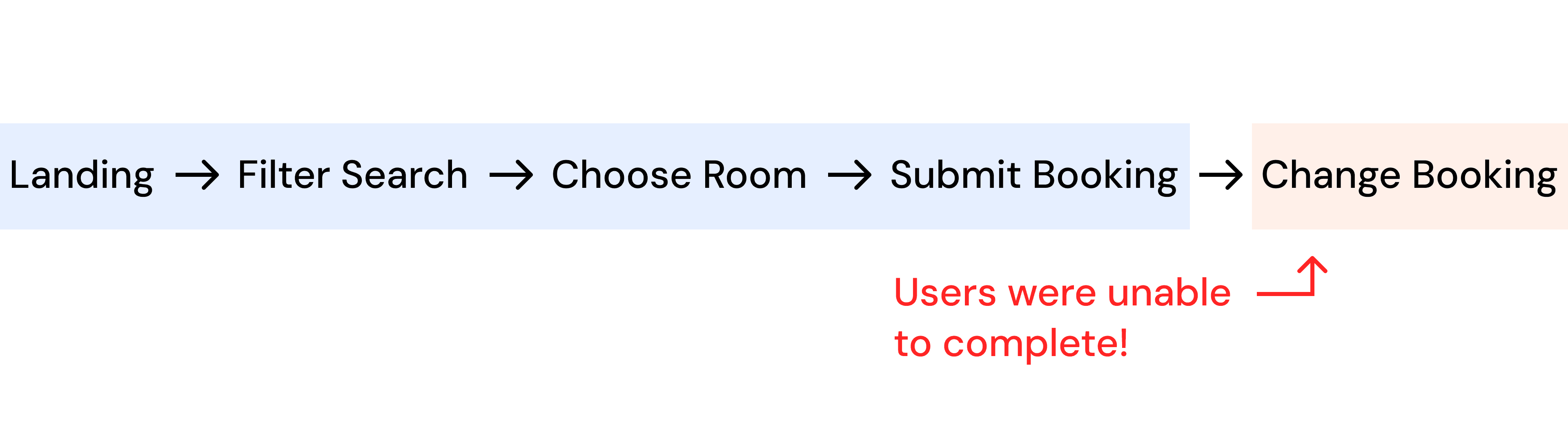
But the second task was the real deal-breaker. Every single participant failed to reschedule without external help.
The cancel link only exists in the email confirmation. This was intentionally not mentioned in the prompt to mirror how many students overlook their inboxes.
Real Frustration
lorum ipsum
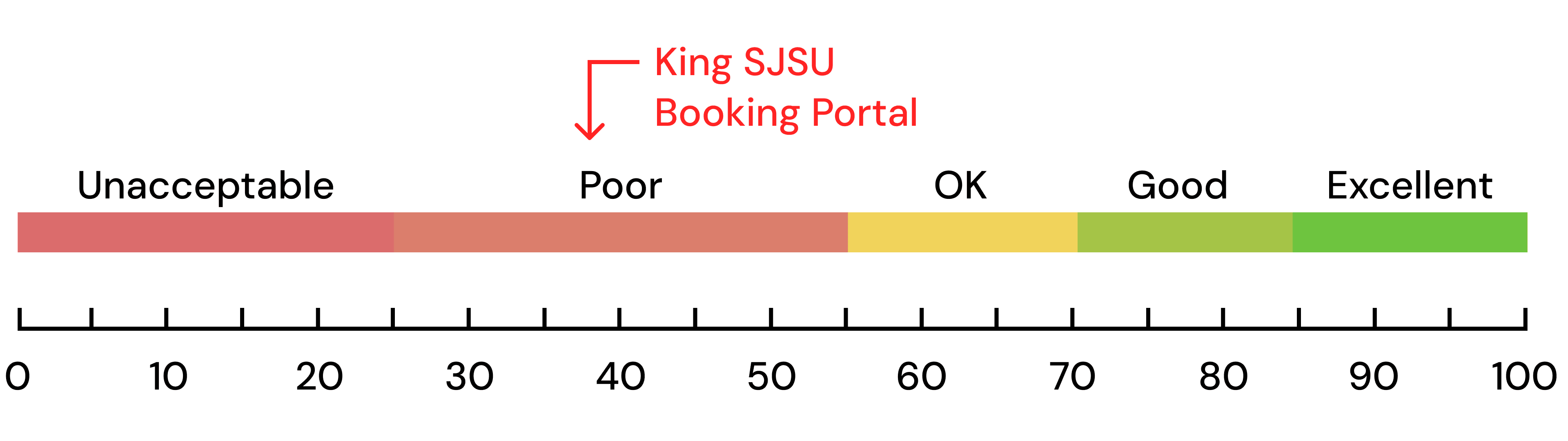
What Was Measured
After testing, each user completed a System Usability Scale (SUS) to quantify their experience. The result was a 37/100 which is classified as “poor.”
The average score across systems is a 68/100. In this particular flow, the booking process ranks well below average.
04 Redesign
With the results from both the heuristic evaluation and the user testing, I could head into the redesign with a clearer understanding of the issues present.
Improved Landing Page
Replaced visually busy banner
Removed wall of text, integrated info where needed
Search and calendar view side-by-side
Clearer text hierarchy
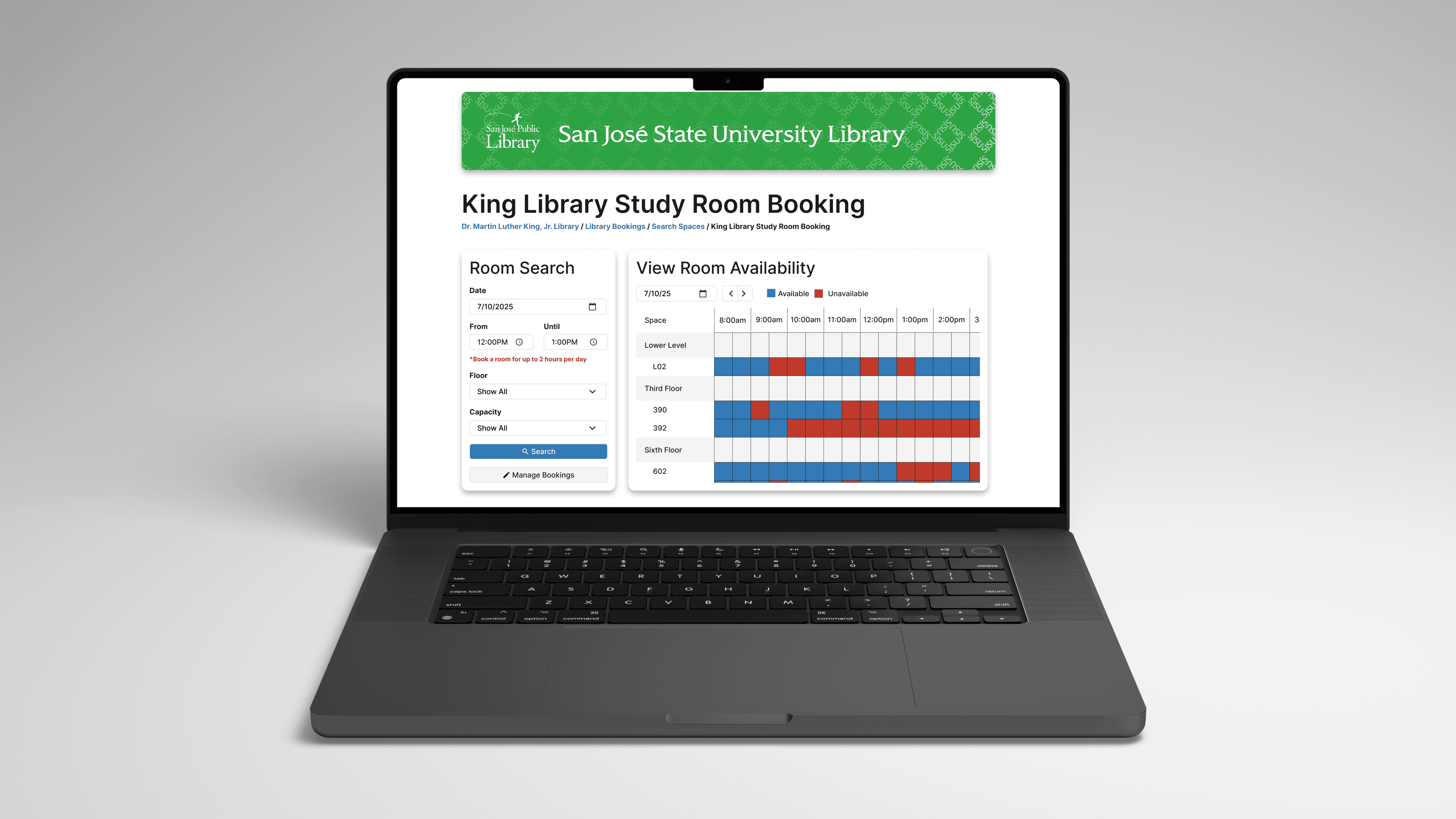
Redesigned landing page
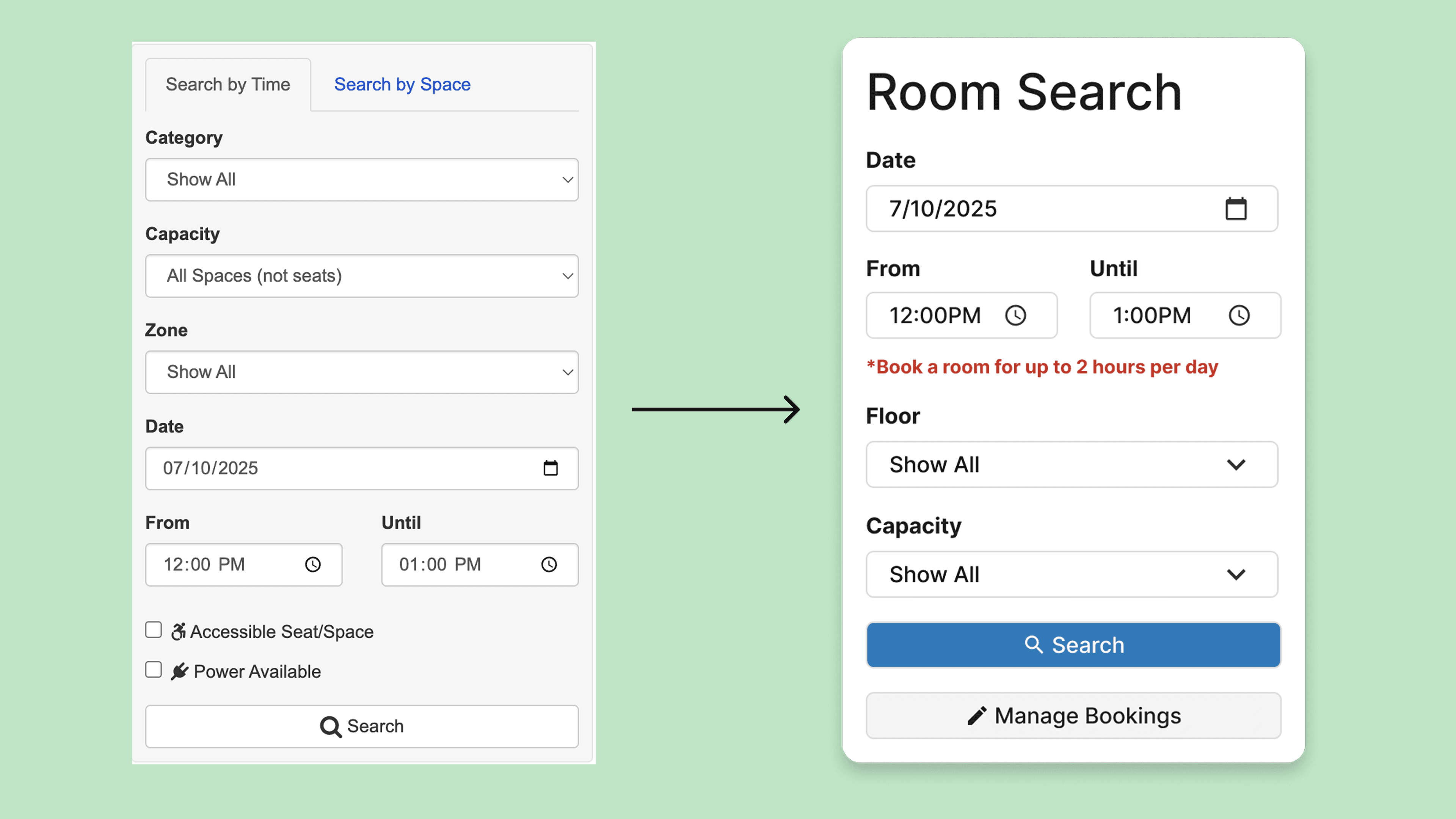
Improved Filter Search
One cohesive room search (rather than time vs. space)
Date-first flow (more intuitive than space-first)
Improved 2-hour limit salience
Clarified difference between floor and zone filters
Removed unnecessary filters
Added Manage Bookings
Ability to change the booking date and time
Ability to delete booking
Scalable to multiple bookings
View previous bookings
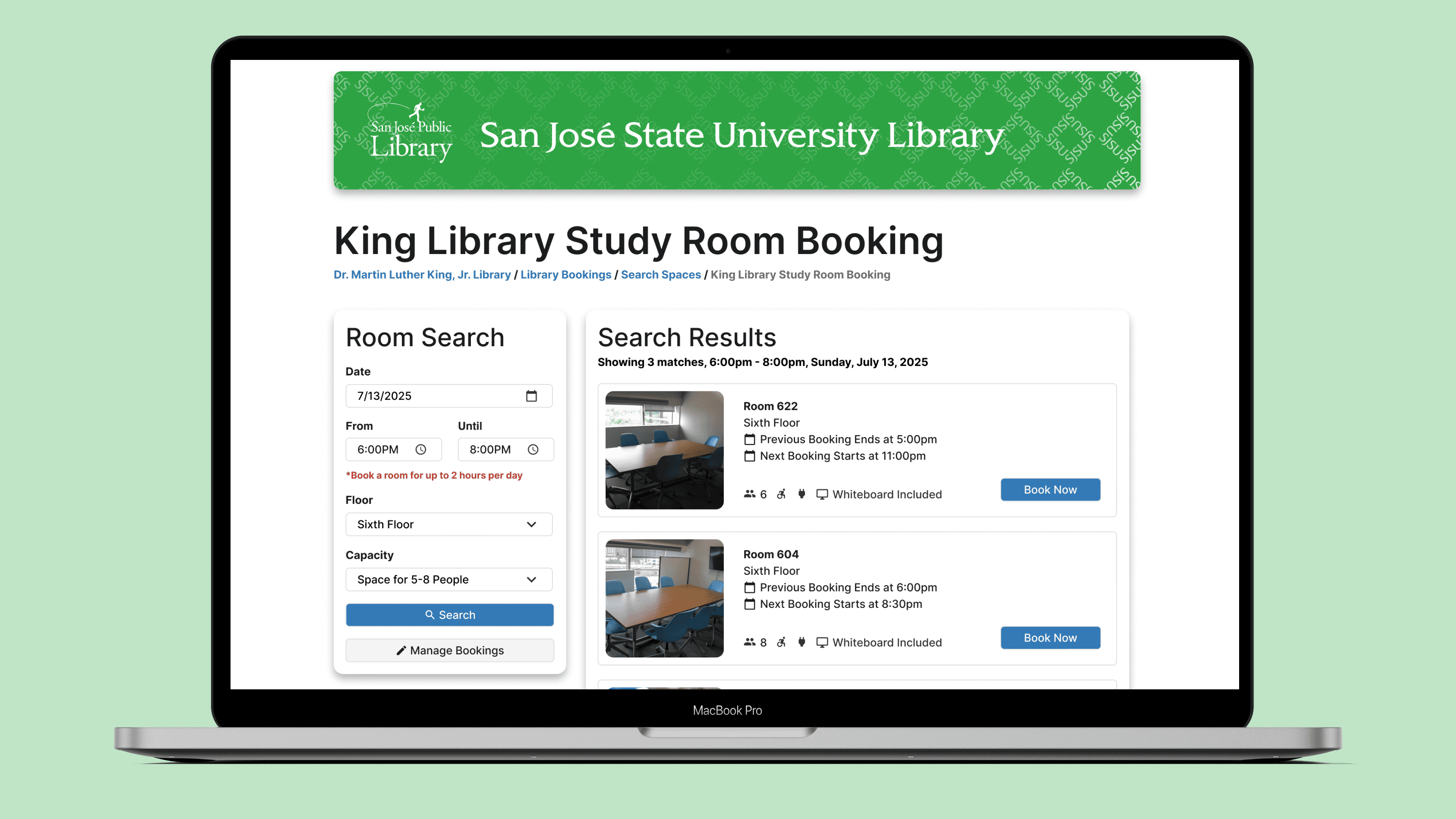
Improved Search Results
No placeholders — representative room pictures
Improved information organization on room cards
The redesign also aimed to produce a working prototype that lets users complete the entire booking flow.
05 Validation
I ran five user tests in the same format as the discovery phase in order to validate and confirm that the redesign did in fact improve on usability, aesthetics, and overall satisfaction.
Full validation booking flow
What Was Measured
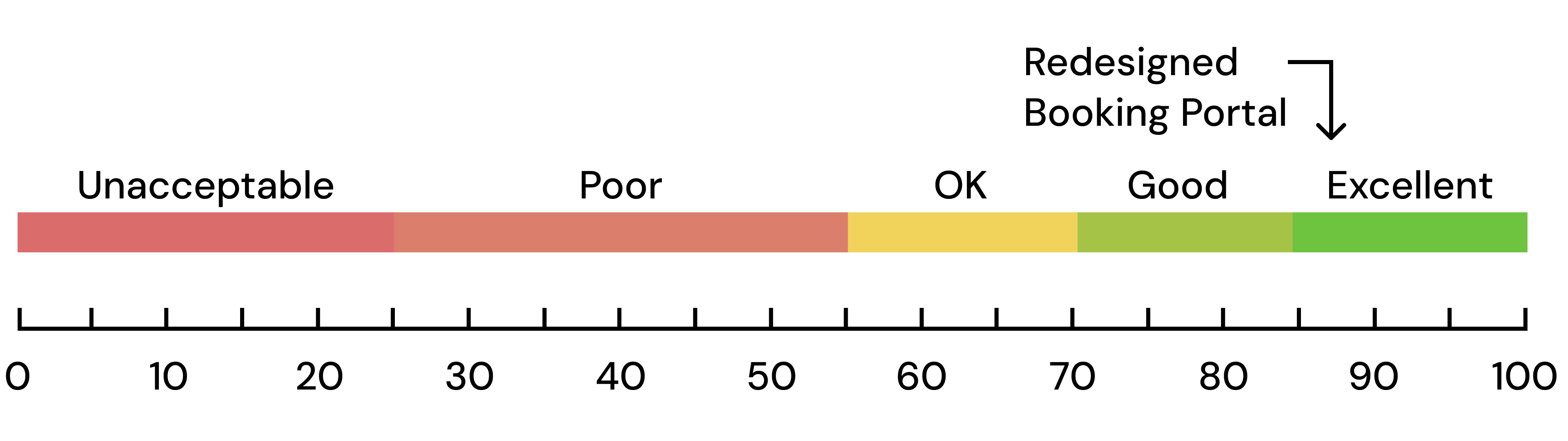
The resulting SUS Score was a 87.5/100 which is classified as “excellent," an improvement from the original score of 37/100.
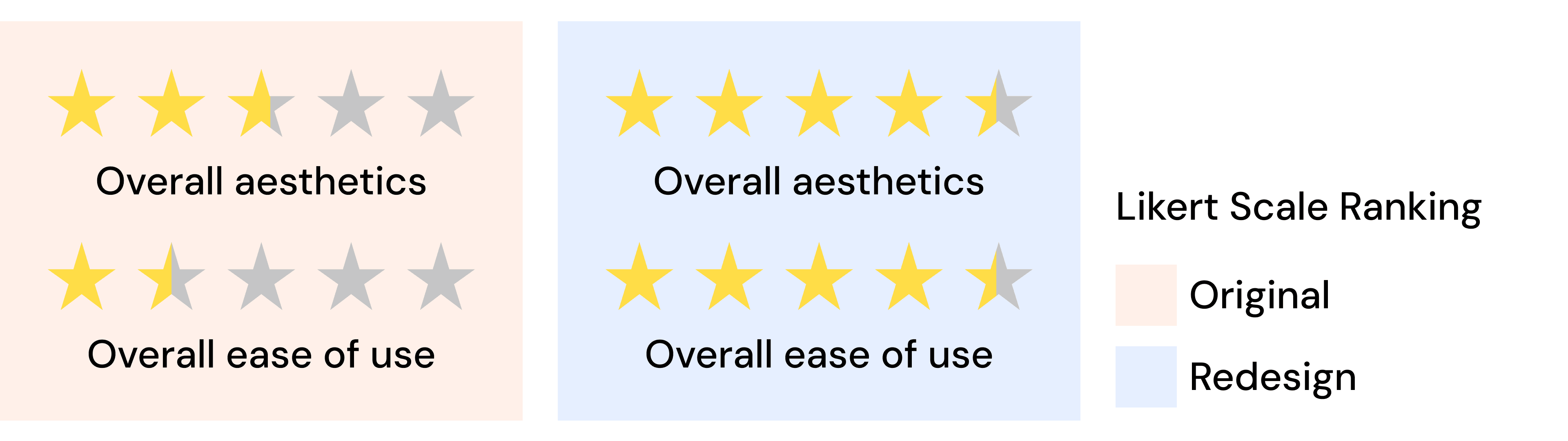
Overall Satisfaction
At the end, users were asked how easy to use, confusing, aesthetically pleasing, and organized the new portal was, and the results were resounding.
05 Reflection
I was really glad that the redesign was both a qualitative and quantitative success!
What I Learned
Going through the full process, from discovery and research to redesign and validation, showed me that effective design isn’t about personal taste. It’s about evidence. User behavior and feedback revealed gaps I wouldn’t have seen otherwise, grounding design decisions in reality rather than assumptions.
What I Enjoyed Most
For me, interviewing participants was my favorite part! These interview sessions allowed me to hear their input, and give me a chance to articulate my thought process and design choices, and it was very rewarding seeing it come to life.
Next Steps
I’d expand the filter system to support multi-selects, like choosing multiple floors or capacities because during my testing, I found that many users just wanted any available room, not a specific one.
I’d also explore the calendar-based booking view. It’s a visual, intuitive approach, but complex to prototype and test, so it wasn’t fully realized in this version.