Tallyrus App Design
An end-to-end design of an AI powered edtech study app for San Jose Consulting Group.
Role
Product Designer
Date
Mar - May 2025
Scope
Visual Design, Interaction Design, Product Thinking
Tools
Figma, Adobe Illustrator
⭐️ Highlights
01 The Problem
As AI becomes a staple in students' academic lives, there's a growing need for tools that harness its power for real academic needs.
Why This Matters
With the rise of AI, over 60% of students have adopted tools like ChatGPT to help with their homework and test prep. But in practice, studying often means juggling AI tabs on top of PDFs, lecture notes, and other resources just to get through one exam!
There’s too much friction, too much context-switching, and here lies the opportunity, a tool that allows students to focus on what truly matters: learning.
Team
One other designer
A project manager
Product owners
Front end developers
02 The Challenge
As AI becomes a staple in students' academic lives, there's a growing need for tools that harness its power for real academic needs.
Why This Matters
With the rise of AI, over 60% of students have adopted tools like ChatGPT to help with their homework and test prep. But in practice, studying often means juggling AI tabs on top of PDFs, lecture notes, and other resources just to get through one exam!
There’s too much friction, too much context-switching, and here lies the opportunity, a tool that allows students to focus on what truly matters: learning.
Team
One other designer
A project manager
Product owners
Front end developers
02 Competitor Analysis
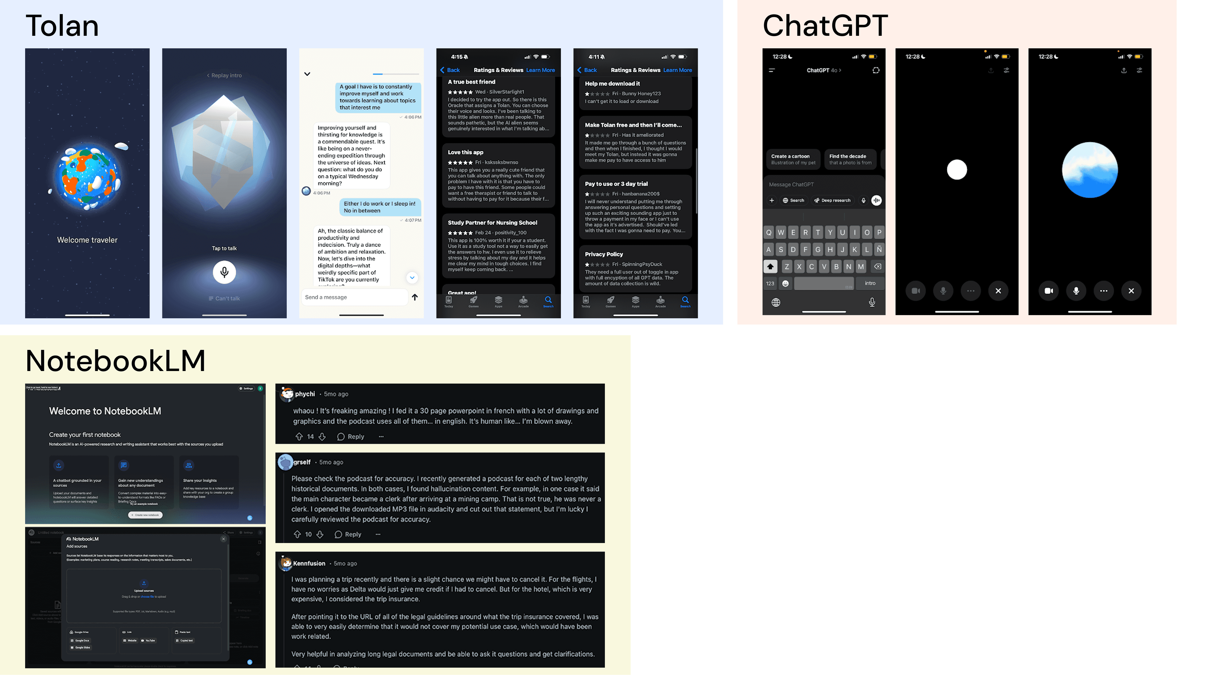
To better understand the landscape of AI-driven study tools, we analyzed three key players: Tolan, ChatGPT, and NotebookLM.
Tolan
Uses customizable characters and casual language to connect with students, but a paywall and limited appeal beyond younger users are key drawbacks.
ChatGPT
ChatGPT handles complex topics well and supports many use cases, but it lacks personalization and a study-focused interface.
NotebookLM
NotebookLM supports many file types and shows sources clearly, but it's less useful for everyday studying and can conjure false information with complex input.
Insights
Students need a study app that supports flexible file formats and is designed specifically around their workflows, not just general use.
With a clearer understanding of user needs and market expectations, we were able to identify visuals, document organization, and engaging AI chats as focus points.
03 Design Process
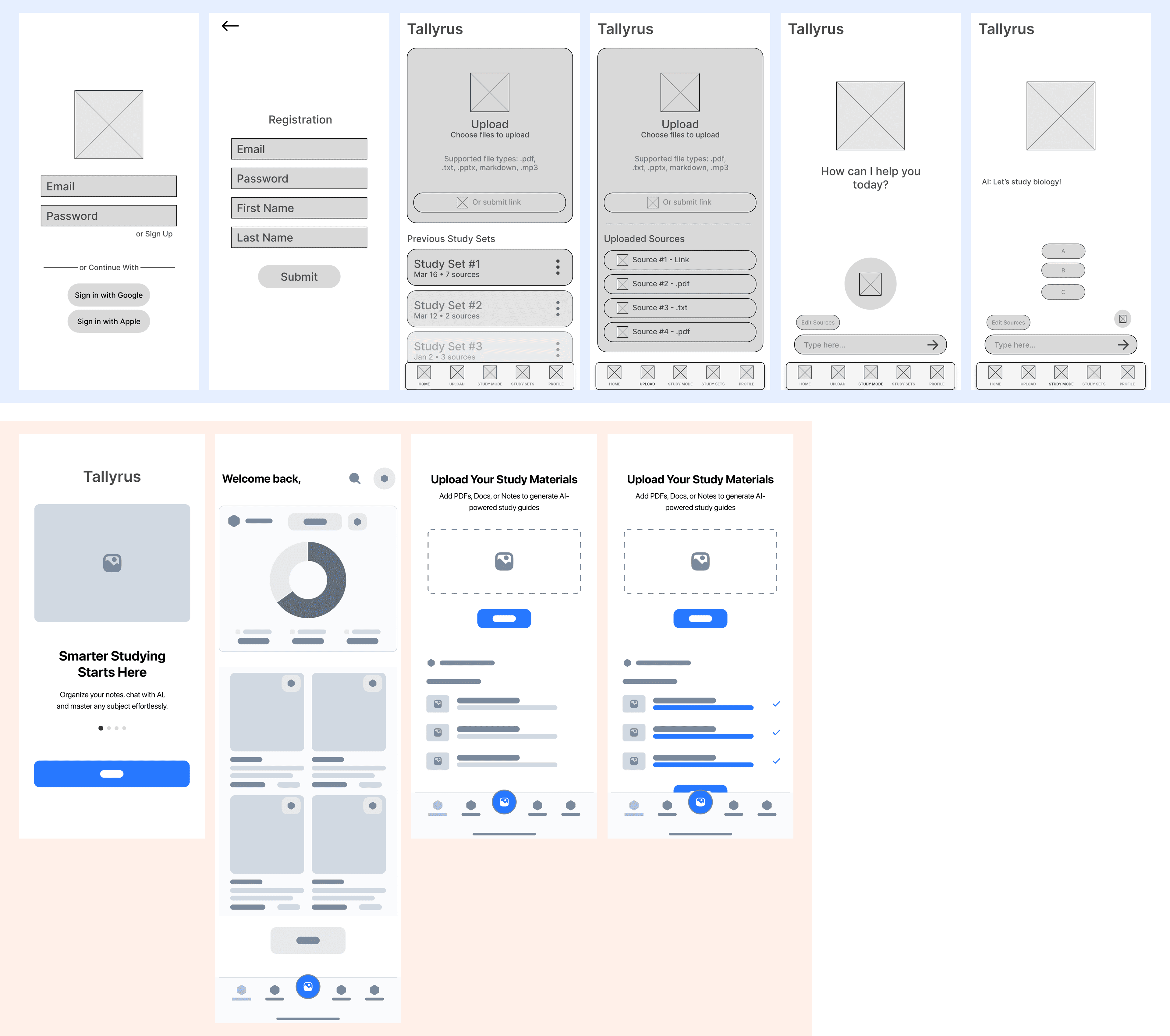
Low Fidelity Design
As a team of two designers, we built two sets of low-fidelity wireframes from the ground up, focusing on:
Onboarding
Document set organization
Study progress stats
AI voice and text chat
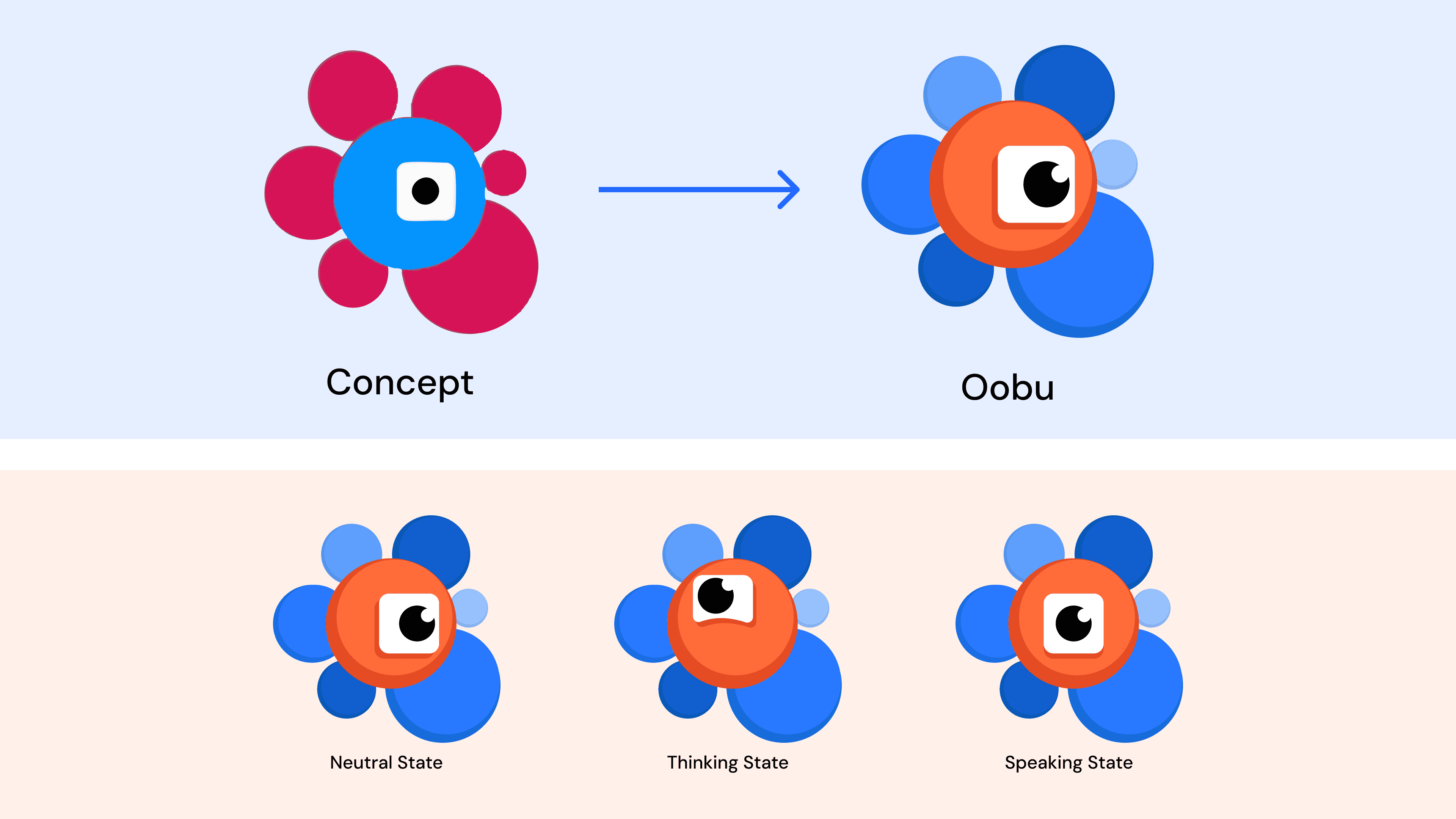
Character Creation
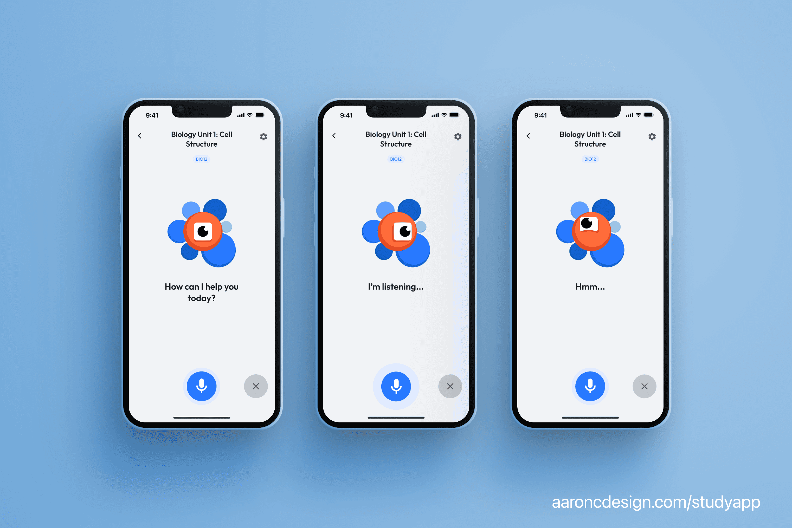
Meanwhile, I focused on developing the AI character interaction which we identified as a core avenue of engagement for the app.
Starting with only a rough concept from the product owner and full creative freedom, I iterated, explored, and ultimately created Oobu, a friendly, expressive, and approachable character that would appeal and engage students.
Oobu would feature emotional states and dynamic petals that responded to voice pitch or pulsed rhythmically while the character was thinking. This interaction was inspired by audio-reactive animations seen in competing products but was adapted to fit our unique character and tone.
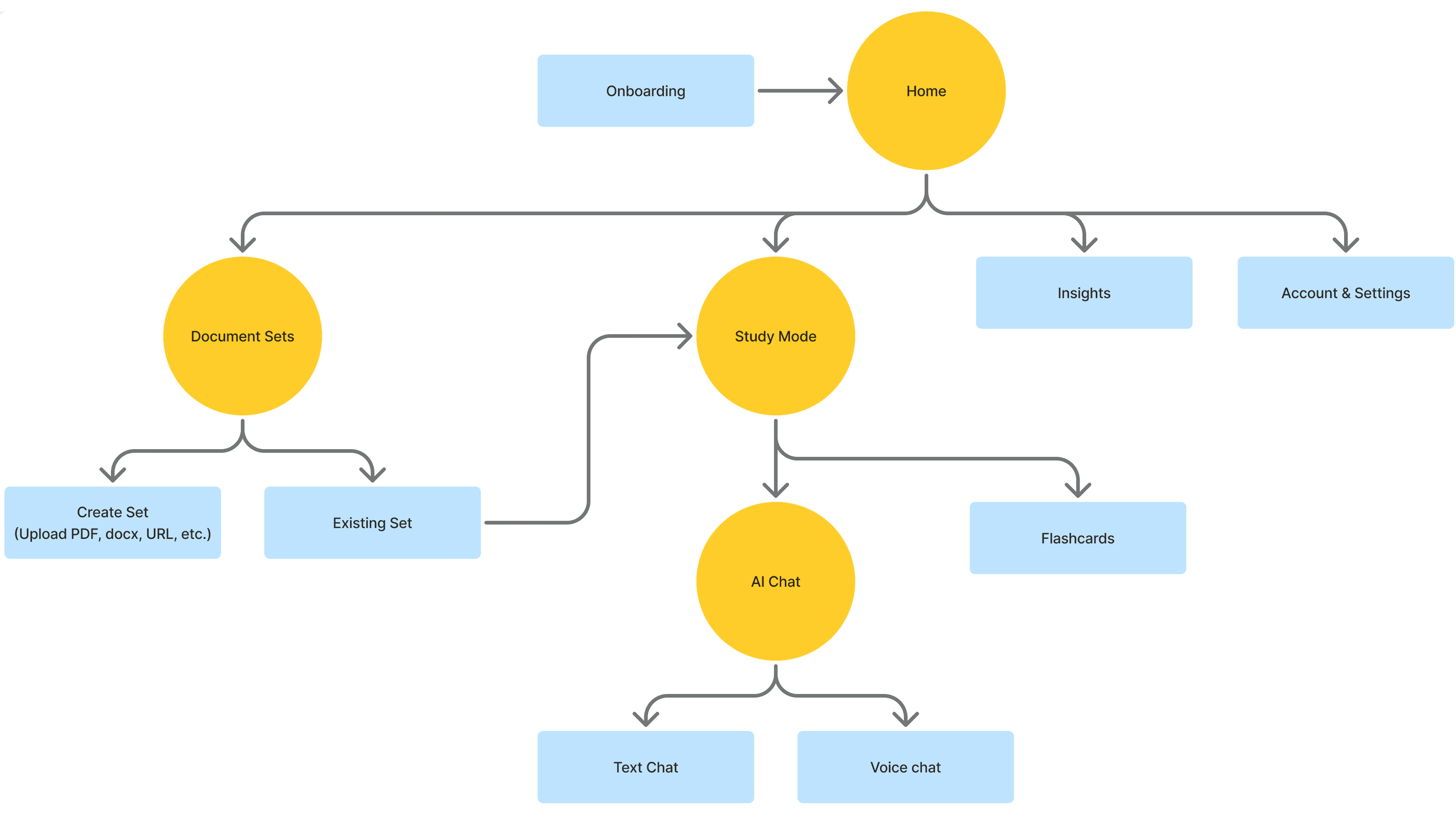
User Flow Overview
With the key pieces coming together, we had a clearer sense of how the app would be structured moving forward.
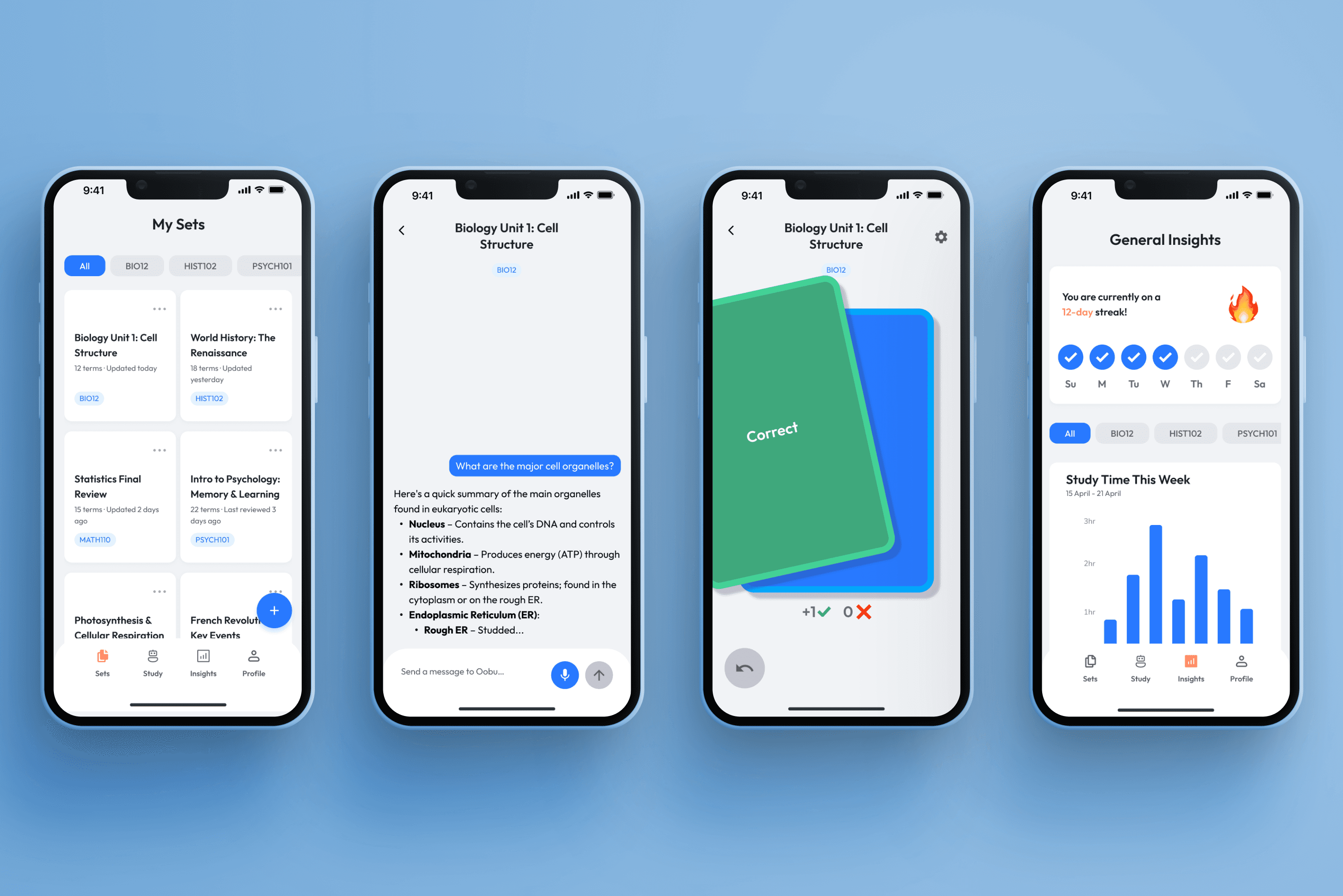
At the core of the experience was Study Mode, which we divided into two main tools: Flashcards and AI Chat. Flashcards offered a focused experience, while AI Chat allowed for open-ended learning.
We further split AI Chat into voice and text options. Voice chat supported hands-free use, a natural flow, and stronger engagement. Text chat offered greater precision, accessibility, and the benefit of a written record students could revisit.
04 Final Design
And after many brainstorming sessions, design critiques, and meetings with the product owners, PM, and fellow designer, we reached the final design.

In the end, we created high-fidelity screens and user flows ready for development hand-off. Let's dig into some of the details.
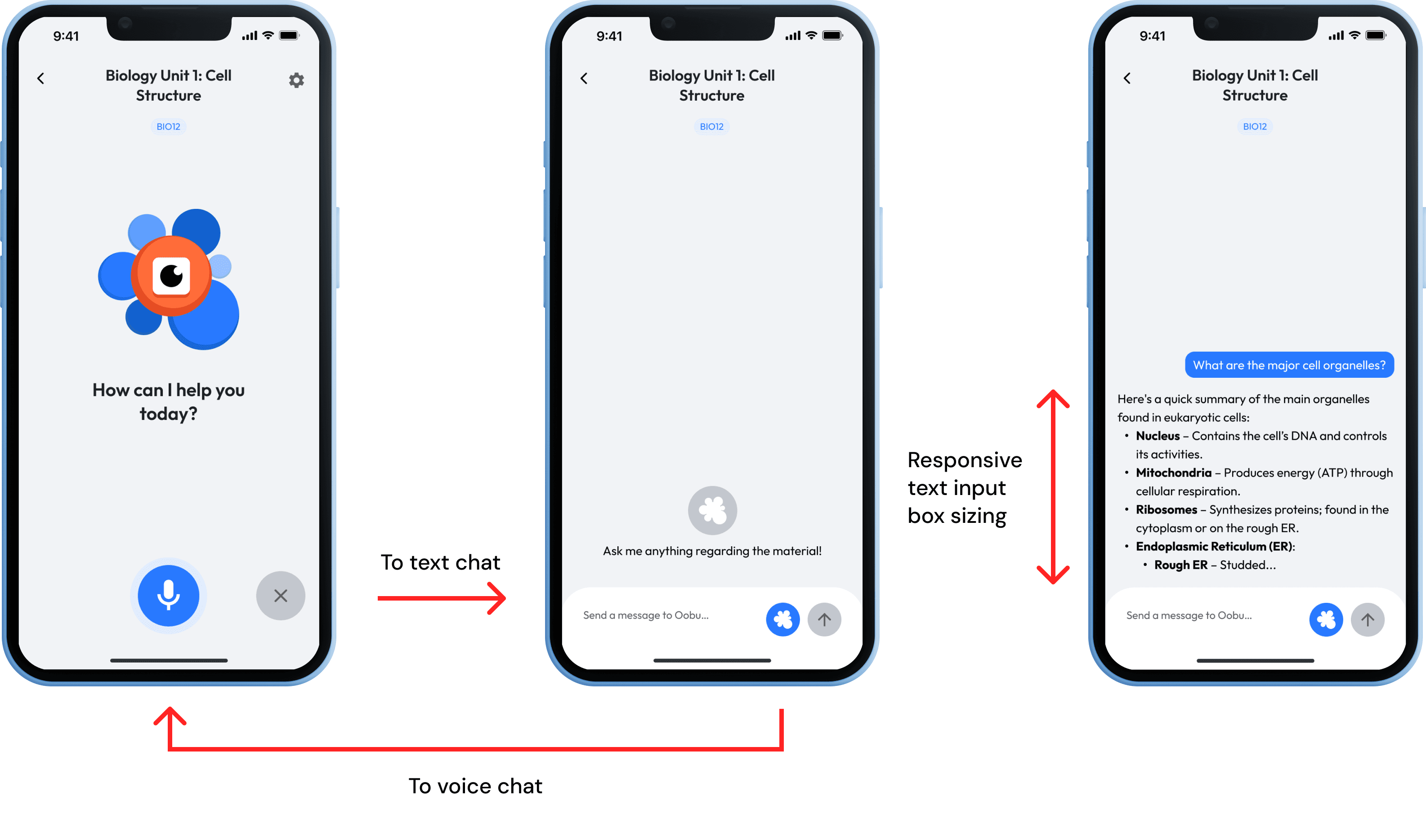
AI Chat
I designed both a voice and text chat to enable different experiences.
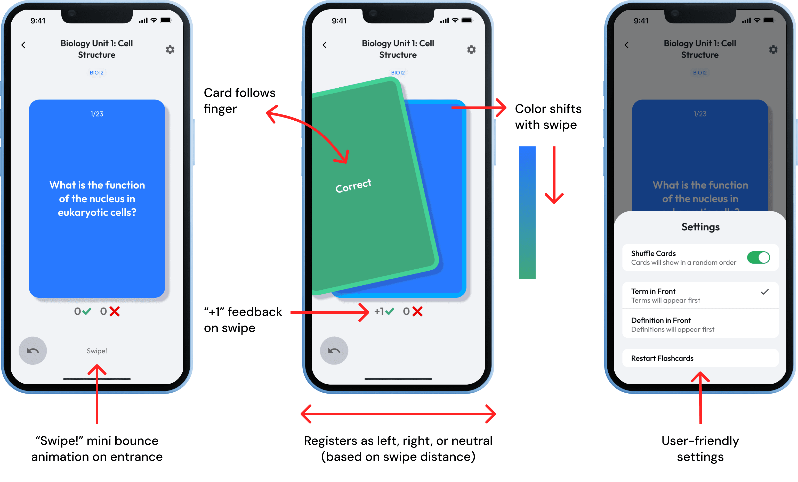
Flashcards
I designed an interaction model inspired by physical flashcard behavior with micro-interactions that give users real-time feedback.
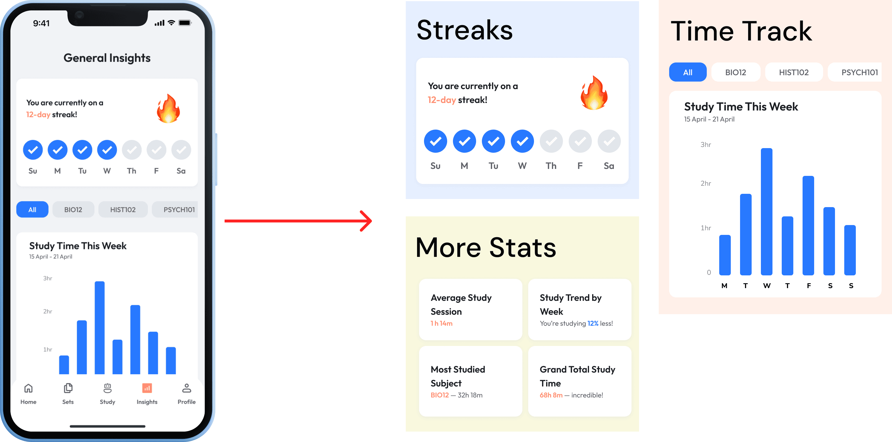
Insights Page
We recognized that insights and statistics can help motivate students to study for longer periods of time.
So by tracking statistics like streaks, average study time per day, trends, and most studied subjects, it can be a fun way to engage and retain students.
05 Reflection
What I Learned
Collaborating with a more experienced designer was incredibly eye-opening! I gained insight into how they structured their Figma files, approached workflows, and used tools and plugins to streamline their process.
Being exposed to this gave me a clearer sense of professional design practices, which allowed me to be faster and more intentional with my own work flows
Next Steps
Like many startup ideas, success hinges on execution. I would prioritize close collaboration with developers to ensure a comprehensive implementation that aligns with our design vision.
Future Exploration
If I had more time, I'd be interested in experimenting with new interaction modalities like audio and motion design in things like success states and AI voice chat to really push that user engagement to the next level.
There’s still a lot of potential in this space, how might we make studying feel more like a conversation than a chore?